Think of ecommerce visual merchandising as the digital version of a beautifully arranged storefront window. It's the art and science of how you present products online to pull people in, keep them engaged, and ultimately persuade them to buy. It goes way beyond just having nice pictures; it's about crafting a deliberate visual journey using stunning imagery, thoughtful layouts, and compelling brand stories.
Why Your Digital First Impression Is Everything

In the world of online retail, you get one shot at a first impression. Your website is your storefront, your top salesperson, and your brand's biggest advocate, all in one. Customers can't physically touch or try out your products, so they rely entirely on what they see to build trust and decide whether to stick around.
This is where strong visual merchandising becomes your secret weapon. It’s not just about aesthetics; it’s about the psychology of presentation. A well-merchandised Shopify store doesn't just look good—it intuitively guides visitors from the moment they land on your site straight through to checkout, turning casual window shoppers into paying customers.
To help you get started, here's a quick breakdown of the core pillars that make up a winning visual merchandising strategy.
Core Components of Ecommerce Visual Merchandising
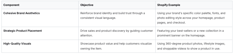
Thinking through these components helps ensure your strategy is comprehensive and effective from the get-go.
Building Trust One Pixel at a Time
A clean, professional, and cohesive look instantly tells shoppers you're a credible business. When your product photos are crisp, your layout is uncluttered, and your branding is consistent, people simply feel more comfortable and confident pulling out their credit cards. This visual harmony is a massive part of creating a great customer experience. For a deeper dive, check out our guide on ecommerce user experience best practices.
The stakes are higher than ever. The global e-commerce market hit an estimated $34.1 trillion in 2024 and is on track to soar past $71 trillion by 2030. In a marketplace this vast and competitive, how you present your products is what makes you stand out.
Your visual merchandising is your silent salesperson. It guides, persuades, and builds a relationship with the customer without saying a word, directly influencing their decision to click "Add to Cart."
Ultimately, getting this right does more than just make your store look pretty. It keeps people on your site longer, encourages them to explore different products, and builds the kind of loyalty that brings them back again and again. You're creating a shopping experience that feels both beautiful and completely effortless.
Crafting Your Digital Storefront Layout
Think of your homepage and category pages as your prime real estate. They’re the front door and the main display windows of your digital shop. This is your first—and maybe only—chance to grab someone's attention and pull them deeper into your brand's world. It’s not just about looking pretty; it's about strategically directing a visitor's eyes exactly where you want them to go.
You have to think like a retail architect, designing a customer journey that feels completely intuitive. What should they see first? A high-impact banner announcing a new collection or a can't-miss sale. This instantly creates a hook, giving them a reason to stick around and explore.
Great visual merchandising on your site means having a layout that makes sense. No one should ever feel lost or confused about what to do next. Use stunning collection tiles with top-notch photos to act as your store's signposts, guiding people toward your best-sellers, new arrivals, or whatever you’re pushing at the moment.
Building an Intuitive User Journey
Your main goal here is to get rid of any friction. A great layout uses a mix of visual signals to create a smooth, clear path from the moment someone lands on your site to the moment they check out. A clean, organized grid, for example, is a fantastic way to present products. It's easy on the eyes and lets people scan quickly, which is absolutely crucial on mobile.
Don't underestimate whitespace. It’s not just empty space; it's a powerful design tool. Giving your images and text room to breathe makes the whole page feel more organized and less overwhelming. It reduces clutter, makes things easier to read, and can even give your products a more premium, high-end feel.
The competition is fierce. With global e-commerce sales expected to reach $7.4 trillion by 2025 and over 28 million online stores out there, a well-planned layout isn't a "nice-to-have." It's fundamental to building trust and actually making sales. You can find more stats on the growth of e-commerce at SellersCommerce.com.
A great layout doesn’t just show customers what you sell; it tells them how to shop. It's the unspoken guide that makes navigating your store feel natural and satisfying.
When you bring all these pieces together, you create an experience that feels both polished and incredibly easy to use.
Key Layout Techniques for Shopify Stores
So, how do you actually do this on your Shopify store? Here are a few concrete techniques you can apply to your theme today:
- The "Hero" Section: This is the big, bold image or video at the very top of your homepage. It’s your digital billboard. Make it count! Feature your most exciting offer, a new product drop, or something that instantly communicates what your brand is all about.
- "Shop the Look" Features: Don't just show a single sweater. Show it styled with pants, a necklace, and a great pair of shoes in a lifestyle photo. This helps customers see how products fit into a real-life context and is a proven way to increase the average order value.
- Navigation That Makes Sense: Keep your main menu dead simple. Use the words your customers would use, like "Dresses" or "Skincare," not internal jargon. Think about how people actually browse and build your navigation around that behavior.
By carefully planning your digital storefront's layout, you're not just showing off products. You're taking shoppers by the hand and leading them on a journey that builds confidence in your brand with every click.
Creating Product Visuals That Actually Sell

In ecommerce, your visuals aren't just a part of the product page—to the customer, they are the product. Shoppers can’t touch or feel what you're selling, so your photos and videos have to do all the heavy lifting. This means getting far more creative than just tossing up a few sterile shots on a plain white background.
Your mission is to craft a visual identity that actually stops the scroll. Think about everything from the specific lighting you use to the props and models you choose. Are you going for a bright, airy vibe or something more moody and high-contrast? The answer should feel true to your brand's personality and connect with the people you want to sell to.
Whatever you decide, stick with it. A consistent visual theme across your entire store builds brand recognition and signals a level of professionalism that customers trust.
Choosing the Right Type of Visual
Not all product photos are created equal, and they don't all serve the same purpose. The real magic happens when you use different types of visuals to tell a complete story and guide a customer toward making a purchase.
Here’s a breakdown of the core photo types you should have in your arsenal:
- Studio Shots: These are your bread-and-butter photos—clean, detailed, and set against a plain background. They're non-negotiable for showing your product without any distractions, making them perfect for collection pages and the main image on your product page.
- Lifestyle Photos: This is where you bring your product to life. By showing it being used by someone in a real-world scenario, you help customers picture themselves using it. It’s all about creating an emotional connection.
- In-Context Shots: Think of these as a cousin to lifestyle photos, but without a person. It’s about placing the product in a styled environment to showcase its aesthetic and scale. Imagine a ceramic mug on a beautifully arranged coffee table or a cozy throw blanket draped over a chic sofa.
Using a mix of these visuals helps answer unspoken customer questions and builds genuine desire. For a deeper dive into how visuals fit into your wider marketing efforts, our guide on developing an ecommerce content strategy has some great insights.
Creating Stunning Visuals on a Realistic Budget
Let's be clear: you don't need a Hollywood-sized budget to create amazing visuals. The camera in your pocket is likely more than powerful enough, and with a few smart techniques, any Shopify store can produce gorgeous imagery.
If you’re going to invest anywhere, make it lighting.
A simple ring light or a pair of softbox lights can instantly elevate your photos and videos. Even just using the natural light from a large window is a powerful—and completely free—tool.
Don’t forget the power of authenticity. A genuine, behind-the-scenes video or a user-generated photo from a happy customer can often be far more convincing than a perfectly polished studio shot.
Finally, once you've created your beautiful visuals, make sure they don't slow down your site. Learning about optimizing website images for speed and user experience is a crucial final step. It ensures all your hard work actually helps your conversion rate, instead of hurting it.
Using Shoppable Video for Deeper Engagement
Static images are a must-have, but let's be honest—video is where you really start building a connection. It’s the difference between telling someone about your product and showing them. Shoppable video bridges that crucial gap between a customer seeing something they love in action and actually buying it, turning passive scrolling into a genuine shopping moment.
Think about it. Instead of just listing a product's benefits, you can show them. Picture a tutorial on achieving a flawless look with your new skincare line, or a stylist putting together the perfect outfit with pieces from your latest collection. By adding clickable "hotspots" or product tags right into the video, you create a direct, seamless path from inspiration to checkout.
Different Formats for Shoppable Video
There's no one-size-fits-all approach to creating compelling shoppable content. The right format really boils down to your brand's personality, your products, and what clicks with your audience. I’ve often seen that authenticity and real-world context perform far better than a big-budget, glossy production, so don't be afraid to experiment.
Here are a few video formats that consistently deliver results:
- Tutorials and How-To's: These are gold. Show your product solving a real problem for someone. A video demonstrating how to assemble a tricky piece of furniture or apply a new makeup product not only builds confidence but also proactively answers the questions that might stop a sale.
- User-Generated Content (UGC): This is your social proof on steroids. Featuring authentic videos from happy customers shows potential buyers that real people—just like them—are already using and loving your products.
- "Shop the Look" Videos: Perfect for fashion and home decor brands. Showcase multiple products together in a realistic, lifestyle setting. This is a brilliant way to not only highlight individual items but also drive upsells by showing how well they work together.
This entire visual journey can be carefully mapped out, guiding a customer from the moment they land on your homepage, through your categories, and directly to the products that catch their eye.

The visual flow in that infographic really highlights how every element, from homepage banners to category images, has a job to do in leading customers to discover and buy your products.
Implementing Shoppable Video on Shopify
Getting started with shoppable video on Shopify is much easier than you might think. A lot of great apps have popped up that make the process pretty painless. Tools like Moast, for example, let you add shoppable video feeds to your store in minutes, often by pulling in content you’ve already created for platforms like TikTok and Instagram. It’s a smart way to get more mileage out of your existing content.
Expert Tip: Shoppable video isn't just about looking cool; it's a powerful conversion tool. Every click you remove between discovery and checkout significantly lowers the odds of a customer getting distracted and abandoning their cart.
The rise of mobile shopping makes video even more essential. It's predicted that by 2027, mobile commerce will make up a staggering 49.1% of all U.S. e-commerce sales. Shoppable videos are tailor-made for the mobile experience, making them the perfect way to capture this huge and growing market.
Ultimately, your success with video comes down to one thing: creating content that gives your audience real value. If you're ready to start mapping out your video strategy, our guide on ecommerce video production is a fantastic place to begin, no matter the size of your brand.
For a deeper dive into making your videos truly clickable and purchase-ready, check out this excellent resource on interactive shoppable video.
Letting Data Drive Your Merchandising Strategy

Here’s a hard truth: the most beautiful ecommerce site in the world can still fail. Great visual merchandising isn't a one-and-done task you can check off a list. The most successful Shopify merchants I know treat their store less like a static catalog and more like a dynamic, living retail space that constantly adapts to how real customers behave.
Your intuition is a fantastic starting point for creative ideas. But data is what will turn those good ideas into repeatable, measurable profit.
Instead of just guessing which banner looks best or which product collection should get the prime spot on your homepage, let your customers show you what works. It’s all about digging into the analytics that reveal how people actually shop on your site. This is the difference between a store that just looks pretty and one that’s built to convert.
Monitoring What Actually Matters
Your Shopify and Google Analytics dashboards are overflowing with information. It's easy to get overwhelmed. The trick is to ignore the noise and focus on a few key performance indicators (KPIs) that directly reflect how your visual merchandising is performing.
I always recommend clients start by tracking these:
- Click-Through Rates (CTR) on Banners and Heroes: Is anyone clicking on that big "New Arrivals" banner you spent hours designing? A low CTR is a flashing red light. It tells you the creative, the offer, or its placement isn't hitting the mark.
- Collection Page Conversion Rates: This is a big one. Look at the conversion rates for different collections. If your "Best Sellers" collection is converting at 5% but your new "Summer Essentials" collection is stuck at 1%, you know exactly where to focus your attention.
- Product Page Add-to-Cart Rate: This metric cuts right to the chase. It shows you how well your product photos, videos, and descriptions are doing their job. Getting lots of page views but very few adds-to-cart suggests a major disconnect between what people see and what persuades them to buy.
Tools that create heatmaps can also be incredibly insightful. They give you a visual map of where users click, scroll, and hover, showing you instantly which product images are getting ignored or if a critical button is practically invisible to your shoppers.
Test, Learn, and Repeat
Once you have a solid baseline from your metrics, you can start the real fun: A/B testing. This is just a simple way of showing two different versions of an element to your audience to see which one performs better. You can test almost anything, but your time is valuable, so focus on the changes that can make a real impact.
Don't fall into the trap of testing random things just for the sake of it. Always start with a clear hypothesis. For example: "I believe swapping our main product photo for a lifestyle image will increase add-to-cart rates because it helps customers imagine themselves using the product."
Here are a few high-impact tests you can run right away:
- Homepage Layouts: Pit a layout featuring a prominent shoppable video against your current static image banner.
- Product Image Styles: A/B test your polished studio shots against authentic user-generated content (UGC). Sourcing quality UGC can be a game-changer for building trust and social proof. If you're not sure where to start, checking out the top 5 UGC platforms for e-commerce is a great first step.
- Promotional Placements: Does a promo banner get more engagement above the fold, or is it more effective placed further down the page? Test it and find out.
By constantly testing and refining, you create a powerful feedback loop where every decision is backed by real customer data. This is how you transform visual merchandising from a subjective art into a data-driven science, ensuring your store is always optimized for maximum engagement and sales.
Answering Your Top Visual Merchandising Questions
As you start fine-tuning your Shopify store's visual strategy, you're bound to run into a few common questions. I see them pop up all the time with merchants. Getting these sorted out early will save you a ton of headaches down the road.
How Often Should I Actually Update My Visuals?
There’s no magic number here, but I always tell people to sync their visual updates with their marketing calendar. It’s the simplest way to make sure your storefront feels current and supports whatever you’re actively promoting.
Think about major refreshes seasonally. When you launch a Spring Collection or build out a Holiday Gift Guide, that’s your cue to redesign the homepage hero. These big-ticket updates signal a major shift in your catalog and catch the eye of shoppers looking for something new.
For smaller changes, aim for weekly or bi-weekly. Keep an eye on your sales data. Is your "Best Sellers" collection getting stale? Swap in the new top performers. Are certain product images not converting? Test new ones. If you have a high-traffic store, a quick daily check of your analytics can point to easy wins, like switching out a banner that’s getting zero clicks.
It's all about finding that sweet spot between being dynamic and responsive to trends, inventory, and customer behavior, without changing things so often that you disorient your loyal customers. You want freshness, but also familiarity.
What Are the Biggest Mistakes to Avoid?
I’ve seen a lot of Shopify merchants stumble over the same visual merchandising hurdles. Just knowing what they are is half the battle.
Here are the most common pitfalls I see:
- Visual Inconsistency: This is a huge one. When your product photos have different lighting, your fonts are all over the place, and your color palette is chaotic, it just looks unprofessional. Consistency is what builds brand trust.
- A Terrible Mobile Experience: Your store might look incredible on a 27-inch monitor, but if it’s a jumbled, slow-loading mess on a phone, you're losing sales. Most traffic is mobile, so designing for the small screen first isn't just a good idea—it's essential.
- No Clear Visual Path: Throwing everything at your customer at once creates instant decision fatigue. A good layout should gently guide the eye from one point to the next, not create a visual traffic jam.
- Ignoring the Data: So many store owners arrange products based on a gut feeling. That’s a massive missed opportunity. Use your sales figures, heatmaps, and click-through rates to make decisions that are backed by actual customer behavior.
Can I Really Do Shoppable Video on a Small Budget?
Yes, absolutely. You don't need a Hollywood film crew or a six-figure budget to create shoppable videos that actually convert. The camera on your smartphone is more than powerful enough to get fantastic results.
Start simple. Short product demos showing how a piece of clothing fits or how a gadget works are gold. Even better? Authentic videos from your happy customers—that user-generated content (UGC) is incredibly powerful. Many Shopify apps for shoppable video have free or very affordable starter plans.
The real secret is to focus on authenticity and showing value. A genuine, well-lit video you shot on your phone will almost always connect better than a slick, overproduced commercial that feels completely detached from your brand.
Ready to bring your products to life with video? Moast lets Shopify merchants add free shoppable videos to their store in just 5 minutes. You can showcase your best content, Reels, and TikToks right on your product pages—with unlimited views and no caps. Learn more about Moast.
Related content

Turn your social content into a revenue channel
Turn your TikToks and Reels into shoppable videos and boost conversions by 3.5x.