.jpg)
If you want to cut down on cart abandonment, you need to get right to the heart of the problem: eliminate surprise costs, make your checkout process dead simple, and perfect the mobile shopping experience. When you tackle these three areas, you're directly addressing why most shoppers bail, turning what would have been lost sales into revenue.
Why Shoppers Leave Carts Behind

Lost revenue is the most obvious pain point of a high cart abandonment rate. But it's more than just a missed sale. Every abandoned cart represents a customer who was genuinely interested in your product but hit a wall just before the finish line. That friction doesn't just lose you that one transaction; it can break their trust and cost you future business.
To build a real solution, you first have to understand why this happens. The global cart abandonment rate has climbed to a staggering 70.19%. Think about that—for every ten shoppers who add an item to their cart, seven of them walk away. This isn't random; it’s driven by high customer expectations and, most often, by surprise costs like shipping fees and taxes that suddenly appear at the very last step. Digging into the data behind online shopping behaviors can really open your eyes to what’s happening.
The Top Three Abandonment Culprits
While a dozen little things can nudge a customer away, my experience shows that three big issues are responsible for most of the damage. If you focus your energy here, you'll see the biggest impact on your bottom line.
- Unexpected Costs: This is, without a doubt, the number one killer. A customer gets excited about a price on the product page, only to feel ambushed by a much higher total at checkout. Nothing erodes trust faster.
- A Frustrating Checkout Process: Long forms, mandatory account creation, or a confusing layout just add friction. People today expect a quick, smooth, and obvious path to buying. Anything less feels like a chore.
- Poor Mobile Experience: Mobile commerce isn't a trend; it's the standard. A clunky, slow, or hard-to-use mobile checkout is a guaranteed way to lose sales. Tiny buttons and forms that are impossible to fill out on a small screen will send shoppers running.
Before we dive deep into the solutions, it helps to have a quick reference. This table breaks down the most common reasons for abandonment and a quick fix you can start thinking about for each one.
Top Cart Abandonment Culprits and Initial Fixes

Seeing these issues laid out makes it clear that they're not impossible mountains to climb. They are specific, identifiable friction points.
The key takeaway is that most cart abandonment issues are entirely fixable. By diagnosing these friction points and implementing targeted improvements, you can create a checkout experience that reassures customers and guides them smoothly to "complete purchase."
These challenges aren't unique to your store; they're common problems across all of e-commerce. The good news is that there are proven, practical solutions for every single one. In this guide, we’ll walk through the actionable steps you need to turn these weak spots into strengths.
Finding the Leaks in Your Checkout Funnel
Before you can start plugging holes, you have to find them. Guesswork is expensive in ecommerce, and when it comes to cart abandonment, it’s a killer. The only way forward is to stop assuming what’s wrong and start using data to see your checkout process exactly as your customers do.
Think of your checkout as a funnel. Shoppers pour in the top when they add an item to their cart, but only a fraction make it out the bottom with a completed purchase. My job—and yours—is to find the cracks where they're slipping out along the way.
Using Analytics to Pinpoint Drop-Offs
Your first move should be setting up a conversion funnel in your analytics tool, whether that's Google Analytics or another platform. This process lets you map out the exact journey a customer takes, from viewing the cart, to entering shipping info, and finally, hitting that glorious payment confirmation page. This turns a vague feeling of "something's wrong" into a specific, data-backed problem.
For example, you might discover that while 90% of shoppers who add an item to their cart actually view the cart page, a staggering number drop off right after. What if only 40% even start entering their shipping information? That’s a massive red flag. It tells you the problem isn't the product or the initial price—it’s something happening on the cart page itself.
The goal here isn’t just to collect data; it’s about finding the single biggest point of friction. Fixing the one step where you lose the most people will have a much bigger impact than making a dozen tiny tweaks everywhere else.
Once you know where they’re leaving, the next logical question is why. This is where you need to go beyond the numbers. For more ideas on improving your overall sales, you can also check out our guide to increase your ecommerce conversion rate with 8 proven strategies.
Seeing Your Checkout Through Your Customers' Eyes
Analytics tell you what is happening, but they rarely tell you why. For that, you need to bring in the qualitative tools.
- Heatmaps are fantastic. They create a visual map of where users click, scroll, and hover. You might find dozens of people are furiously clicking on a brand logo that isn't actually a link, revealing a clear design flaw.
- Session Recordings are even better—it’s like getting a behind-the-scenes look at a user's entire visit. You can watch their mouse movements, see where they pause in confusion, and witness their frustration as they try to apply a coupon code to a broken field. There's nothing more motivating than watching someone rage-quit your checkout.
This next infographic walks through a clear process for optimizing one of the most critical parts of your checkout experience: payments.
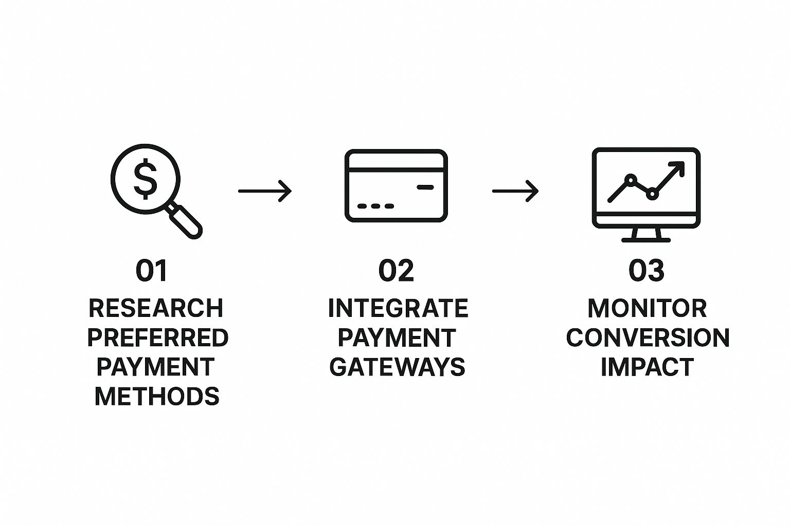
As it shows, the flow is about researching what your customers want, integrating those options, and then monitoring performance. A classic friction point is not offering the right payment methods. A quick look at the most common supported payment methods might reveal obvious gaps in your own checkout.
When you combine the hard numbers from your funnel data with these "why" insights, you get the complete story. This is how you move from just diagnosing problems to rolling out targeted, effective solutions that actually work.
Building Trust by Eliminating Surprise Costs
Let’s be honest: nothing kills a sale faster than a surprise fee at checkout. We've all been there. You find a product, you’re happy with the price, and you’re ready to buy—only to get ambushed by unexpected shipping fees, taxes, and handling charges.
It’s the quickest way to erode trust and send an otherwise eager customer clicking away. This single issue is consistently the top reason for cart abandonment. In fact, 48% of shoppers admit they’ve abandoned a purchase because extra costs were too high.
The trick isn't just showing the final price at the very end. The real solution is to weave total cost transparency throughout the entire shopping experience. It's a proactive approach that stops sticker shock before it starts and builds the kind of confidence that turns browsers into buyers.
Be Upfront with All Potential Costs
You need to demystify every potential fee long before the customer hits the final checkout page. When people can see what they’re likely to pay early on, they feel in control of the process. That feeling of control is huge. It means they’re far more likely to follow through and complete the purchase.
Given that unexpected costs are the biggest deal-breaker, providing transparent fee estimation is non-negotiable for building trust and preventing those last-second bailouts.
Here are a few practical ways I’ve seen this work wonders:
- Shipping Calculators on Product Pages: This is a game-changer. Add a simple field where customers can pop in their zip code to get an estimated shipping cost right then and there. It removes a massive question mark from the very beginning.
- Geolocation for Tax Estimates: Use the customer’s IP address to automatically calculate and display estimated sales tax in the shopping cart. It’s a small technical touch that turns a potential negative surprise into an expected line item.
- Clear Banners for Shipping Thresholds: If you offer free shipping on orders over $50, that message needs to be everywhere—your header, product pages, and cart. It not only clarifies your policy but also nudges customers to increase their order value.
A customer who understands the total cost from the start is a customer who trusts you. By making all fees—shipping, taxes, and handling—visible early, you’re not just showing a price; you’re showing respect for their budget and their time.
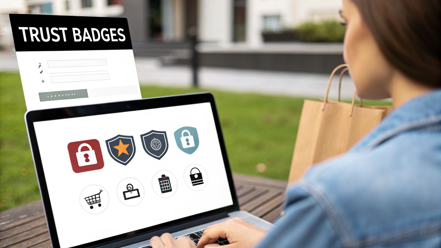
Reinforce Confidence with Trust Signals
Transparency is a huge piece of the puzzle, but you also have to actively reassure anxious customers that their money and information are safe with you. This is where trust signals come in. Think of them as visual cues and policy reminders that help overcome that last-minute hesitation.
For instance, offering flexible payment options can dramatically reduce the financial anxiety that often crops up at checkout. We actually have a whole guide on how Buy Now Pay Later is becoming a checkout must-have that digs deeper into this.
The key is to place these signals strategically, right next to high-friction elements like the "Add to Cart" and "Proceed to Checkout" buttons.
- Security Badges: Display recognizable logos like Norton, McAfee, or Shopify Secure. These are instant visual shortcuts that tell shoppers their payment details are protected.
- Accessible Return Policies: Don't make people hunt for your return policy in the footer. A simple, bold line like “Easy 30-Day Returns” on the cart page can be the deciding factor for someone on the fence.
- Customer Reviews: Don't just leave reviews on the product page. Sprinkle a few top-rated customer comments or star ratings directly in the cart to reinforce the product's value at that critical decision point.
Crafting a Mobile Checkout That Actually Converts
Mobile commerce isn't just another sales channel anymore; for a huge number of businesses, it's the main one. If a potential customer pulls out their phone to buy from you and runs into a clunky, frustrating checkout, you can pretty much kiss that sale goodbye. A smooth mobile checkout isn’t just a nice-to-have feature—it's a core requirement for staying in business.
The data on this is brutally clear. How easy a site is to use on a given device directly impacts whether someone will finish their purchase, and mobile shoppers are by far the most impatient. A staggering 75.5% of carts started on a phone get abandoned, which is a much higher rate than on desktops. You can dive deeper into these mobile shopping cart statistics to really grasp why a mobile-first mindset is so critical.
This means you can't just take your desktop site, shrink it down, and hope for the best. You have to build the experience with the mobile user in mind from the ground up.
Design for Thumbs and Taps
On a smartphone, convenience is king. People are often shopping while they're on the move, maybe with one eye on something else, and their patience for slow pages or clumsy interfaces is practically zero. Your mobile checkout has to feel like second nature.
- Make it load instantly. Every second a customer waits for the payment page to load, their trust in your site drops. Slow loading feels unprofessional and even a bit sketchy. You need to optimize your images, clean up your code, and make sure your server can keep up.
- Use big, tappable buttons. Is there anything more annoying than trying to peck at a tiny button with your thumb and hitting the wrong one? Your "Pay Now" button, form fields, and any other clickable element need to be big enough to be tapped easily without having to zoom in.
- Think about the "thumb zone." Most people hold their phone and navigate with their thumb. Good mobile design places the most important elements—like the "Next" or "Complete Purchase" buttons—within that natural arc of movement. It's a small detail that makes a world of difference in how intuitive the process feels.
Here's my rule of thumb: A great mobile checkout should be simple enough for someone to complete with one hand while holding a coffee. If it requires two hands, pinching, and zooming, you’ve added friction that's actively costing you money.
Declare War on Typing
Let's be honest: typing on a phone is a pain. The single most important mission for your mobile checkout design is to slash the amount of information someone has to peck out on their keyboard. Every single field you can get rid of or fill in for them is a massive win.
So, how can you do it?
- Embrace digital wallets. This is non-negotiable in today's world. Integrating one-tap payment options like Apple Pay, Google Pay, and Shop Pay lets customers breeze through checkout using securely stored information. It completely eliminates the need to manually enter credit card and shipping details.
- Offer social logins. Letting customers sign in with their Google or Facebook account is a quick way to pre-fill their name and email address. It saves them a few steps and reduces the chance of typos.
- Implement address autocomplete. Use a tool like Google's Places API to suggest and fill in the customer's full address as soon as they start typing the first few characters. It's a small feature that feels like magic.
- Be ruthless with your forms. Scrutinize every single field. Do you really need their phone number right now? Is that "Address Line 2" field truly necessary? Cut everything that isn't absolutely essential for fulfilling the order.
By truly adopting a mobile-first philosophy, you're meeting your customers where they are. You're turning what could be a tedious chore into a quick, satisfying end to their shopping experience, which directly fixes one of the biggest leaks in your sales funnel.
Using Shoppable Videos to Boost Buyer Confidence

Let's be honest, static product photos are the bare minimum. They show what a product looks like, but they rarely answer the real questions customers have. How soft is that sweater, really? Is that gadget actually easy to put together? This uncertainty is a massive source of friction and a direct cause of abandoned carts.
The solution? Bridge the gap between just browsing and truly believing with shoppable videos.
Think about it. Video is the closest you can get to putting a product in your customer's hands without them leaving their couch. It transforms a flat, passive viewing experience into an active, engaging one. When a potential buyer sees a dress flowing as someone walks or watches a blender pulverize ice in seconds, it builds a level of confidence that static images just can't touch.
Overcoming Hesitation with Dynamic Demos
One of the best ways to slash your cart abandonment rate is to tackle customer doubts before they even have a chance to take root. Shoppable videos are your secret weapon for this. Instead of just listing features in a bulleted list, you can show them in a compelling, visual story that leaves no room for confusion.
For example, a video for a piece of self-assembly furniture can show the entire process sped up, proving it only takes a few minutes and isn't a weekend-ruining project. A clip for a premium foundation can show the texture and application on several different skin tones. These videos directly address the biggest reasons for hesitation—complexity, quality, and fit.
A shopper who sees proof of a product's value is far more likely to feel confident in their decision to purchase. Video effectively neutralizes the risks and doubts that cause shoppers to pause and ultimately abandon their carts.
From Inspiration to Purchase in One Click
Now, here's where the magic really happens: making these videos interactive. A true shoppable video lets a customer add the featured product to their cart directly from the video player. This is a massive win for impulse buys and drastically simplifies the path to checkout.
Imagine a shopper watching a fantastic tutorial on your product page. Just as their excitement peaks, a "Buy Now" button appears right inside the video. This frictionless path captures their purchase intent at its absolute highest point, removing the extra clicks that often lead to second thoughts and distractions.
If you're a Shopify merchant, getting these dynamic videos onto your site is surprisingly straightforward. We've put together a simple guide on how to add shoppable videos to your Shopify store to help you get started.
Here are a couple of powerful places to use them:
- On Product Pages: Use videos to demonstrate key features and answer common questions. Think of it as having a virtual salesperson on duty 24/7.
- In the Cart: A short video in the cart summary can reinforce the purchase decision. It's a great way to remind the customer why they loved the item in the first place, reducing that last-minute buyer's remorse.
By weaving this strategy into your store, you’re not just showing your products anymore—you’re proving their worth. And that proof builds the trust you need to get more customers across the finish line.
Answering Your Top Cart Abandonment Questions
Even with a solid plan, you're bound to run into some specific challenges when you start digging into your cart abandonment problem. Let's tackle some of the most common questions I hear from store owners, with practical answers to help you sharpen your strategy.
What’s a "Good" Cart Abandonment Rate, Anyway?
Look, the industry average hovers around a jaw-dropping 70%. But chasing a single "good" number is a fool's errand. It's completely relative. A store selling custom-built furniture will always see more abandoned carts than a shop selling phone cases. The bigger the purchase, the more people hesitate.
Instead of obsessing over a universal benchmark, focus on your own improvement. The goal is progress, not perfection.
The top-tier ecommerce stores I've seen usually manage to get their rates down somewhere in the 40-60% range. A fantastic starting goal for your own store is to aim for a 10-15% reduction from where you are right now. This gives you a clear, measurable target and keeps you motivated.
When Is the Best Time to Send a Cart Recovery Email?
Timing is absolutely crucial here. A shopper's desire to buy is never higher than in the moments right after they leave your site. That's the window you have to hit.
Sending that first recovery email within one hour is non-negotiable. It catches them while your product is still top of mind.
A three-part email sequence is a proven winner. Here's a flow that works wonders:
- First Email (within 1 hour): This is just a gentle nudge. "Did you forget something?" It’s often all you need to bring a distracted shopper back to finish their order.
- Second Email (at 24 hours): Time to follow up. You can use this one to reinforce the value, maybe by highlighting product benefits or showing off some glowing customer reviews.
- Third Email (at 3-5 days): This is your final shot. Consider offering a small, time-sensitive incentive like free shipping or a modest discount to create a little urgency.
If you want to go deeper on what to write and when to send it, check out our complete guide on abandoned cart email strategies for increasing recoveries.
Should I Force Customers to Create an Account?
Let me be blunt: absolutely not.
Forcing account creation before checkout is a conversion killer. It’s one of the biggest reasons people just give up and leave. Shoppers today demand a fast, frictionless experience. A mandatory sign-up is like putting a velvet rope and a bouncer in front of your cash register.
Always, always offer a prominent guest checkout option. It shows you respect your customer's time and removes a massive barrier to making a sale.
You can still encourage people to create an account—just do it after they've paid. Once the transaction is done, frame it as a benefit. Offer things like easy order tracking, access to special deals, or a saved profile for next time. This transforms it from a frustrating roadblock into a helpful feature, which is a much better way to start a customer relationship.
Ready to turn abandoned carts into sales with engaging, high-converting video content? Moast allows you to add shoppable videos to your Shopify store in just five minutes, completely free. Showcase your best content and boost conversions today.
Related content


Turn your social content into a revenue channel
Turn your TikToks and Reels into shoppable videos and boost conversions by 3.5x.